The Poster That Tries to Say Everything
Poster visual hierarchy helps passers-by spot the main message, find practical details and decide what to do next without sorting through competing emphasis.
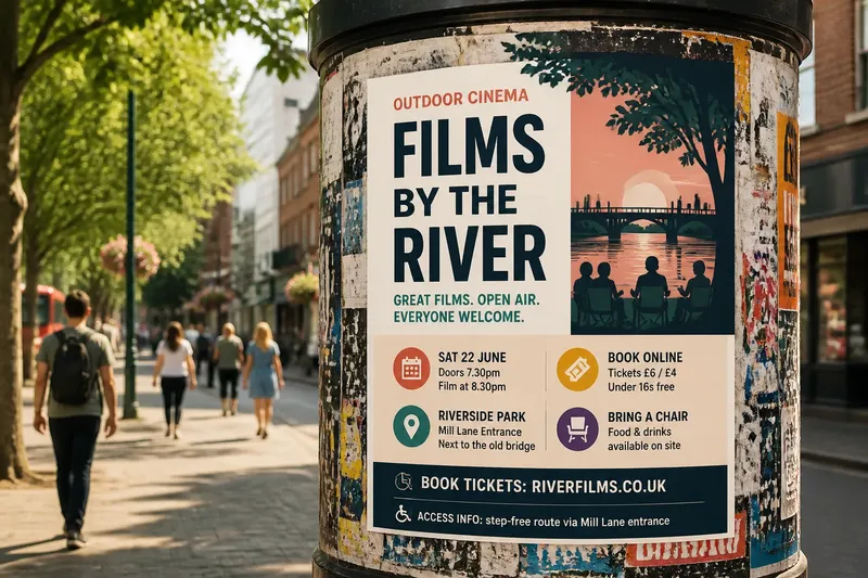
How do you make a poster’s main point visible before a passer-by has walked past it? Poster visual hierarchy gives the eye a first stop, then a clear route through the details. The challenge is deciding which message deserves the strongest emphasis and letting the rest support it.
A crowded poster often comes from good intentions: include the event name, date, venue, speakers, sponsor logos, booking link and access information. But if every item is large, bold or brightly coloured, the viewer must sort the information before understanding the announcement. A useful poster makes that order clear.
Think of hierarchy as an order of attention, not a ranking of people or organisations. A sponsor may matter greatly to the organiser, but a passer-by usually needs to identify the event first. The poster can acknowledge every contributor without asking every line to shout.
Poster visual hierarchy begins with the passer-by’s question
Before moving text or changing type, write down the question a person should be able to answer at a glance. For a community film night, it might be, “What is happening?” The answer could be the event name, “Films by the River”. The date, location and booking details answer the next questions: when, where and how?
The right order depends on the message. A safety notice may need to lead with an action. A gallery poster might lead with the exhibition name or artist, depending on what will help its audience recognise the invitation. Choose the first answer deliberately rather than giving every item equal prominence by default.
Write the message in plain language, then sort it into three groups:
- Main point: the event, offer, announcement or action.
- Essential details: information someone needs to decide whether to act, such as the date, place or eligibility.
- Supporting details: background, credits, partner names and other useful but secondary information.
These groups are a working order, not a verdict on what deserves respect. If a supporting detail is legally required or essential to participation, move it into the essential group. If it cannot be removed, present it quietly but keep it legible.
A seven-day routine works for posters of any size
You can use this routine for a quick notice or a poster with several contributors. Spread the work across a week if your deadline allows; otherwise, move through the same decisions in order. The aim is to avoid making copy, hierarchy and decoration decisions all at once.
Monday: collect and sort the information
Gather the wording, dates, venue details, access information, contact route, required logos and any text that must remain unchanged. Ask the person responsible for each detail to confirm it. Mark each item as main, essential or supporting before styling the draft.
If people disagree about which line should lead, ask what a passer-by needs to recognise first. Record genuine constraints, such as a sponsor’s required logo treatment, separately from preferences such as “make this line more exciting”. Constraints need accommodation; preferences still need design judgement.
Tuesday: write the one-sentence message
Write one sentence that states what the poster announces and who it is for. “Free repair café for local residents” gives a clearer starting point than “Join us for a brilliant community event”.
Choose a short headline that carries that meaning. It can be a name rather than a sentence, but readers should not have to decode a slogan before learning what the poster concerns. Add necessary context nearby if the title alone is ambiguous.
Wednesday: put the copy in reading order
Arrange the content in the order someone is likely to need it: main point, decision-making details, then supporting information. Read the text aloud and remove repetition. If the headline says “Open studio”, a second line saying “Come and visit our open studio” may add no useful fact.
Check the essential details together. A date without a place, or a booking link without a clear invitation to book, can leave the viewer unsure what to do. Keep the action and its route close enough to read as one unit. Do not hide a key condition in tiny type because it is awkward to fit.
Thursday: sketch the layout
Use plain rectangles or a quick paper sketch to decide where the groups sit. Give the main point a distinct area. Place related information near one another and leave open space between groups. A simple left-to-right or top-to-bottom route is often easier to scan than a layout that sends the eye back and forth.
Choose one or two typefaces with clear, readable letterforms. Use differences in size, weight and spacing to establish roles rather than assigning a new style to every line. Position, colour and empty space can also separate elements. If everything is bold, a bright colour will not restore an order that the typography has erased.
Make the headline prominent without sacrificing the practical details. A striking title that leaves the date hard to read has not solved the poster’s job. Check the relationship between elements, not just the size of the largest one.
Friday: check the draft at a distance and on a phone
Print a draft at its intended size if possible, or place it at a similar viewing distance in a hallway or near a window. Step away, look briefly, then turn away and note what you remember. You are checking whether the intended main point is the first thing the design makes easy to grasp.
Then inspect the poster on a phone screen. This does not replace checking the physical version: a poster may be seen from across a room, while an image shared in a message is viewed close up. The screen check can reveal small details that disappear in a compressed preview and lines that lose their relationship when scaled down.
Ask a colleague who has not helped write the copy to look briefly. Ask what the poster is about, what they would do next and which detail they noticed first. If they pick out a sponsor or decorative phrase before the event, adjust the relative emphasis. Treat their response as a clue about the design, not a vote on its aesthetic.
Saturday: remove competing emphasis
Review every item with special treatment: large type, capitals, a bright accent colour, a box, an underline or an isolated position. Keep those treatments only where they mark a real change in priority. If several items are highlighted, the highlights may have become decoration rather than guidance.
Look for small wording changes that can restore room. Replace a long venue description with a familiar venue name if the audience will recognise it; retain the fuller address if people need it to find the place. Remove duplicate invitations and general promotional claims before shrinking useful information. The poster should not depend on viewers already knowing what it means.
Repeatedly nudging lines by tiny amounts is not worth the effort before you have decided what the first message is. Fine spacing can polish a sound order, but it cannot decide which information matters first. Settle the order, then refine the spacing.
Sunday: confirm the copy and prepare the file
Compare the final artwork with the approved wording. Check names, dates, venue, contact details, links and required credits. Make sure the main point and the action remain legible in the actual output, not just on a large design screen. If you include a QR code, describe what it opens in readable text and provide a non-digital route where one is needed.
Keep a clean copy of the approved text and artwork. If late feedback arrives, ask whether it adds an essential fact, corrects an error or improves recognition. If it only gives another line equal prominence, consider whether that emphasis is needed. Confirm output requirements with the printer or organiser, and follow their instructions for file preparation and any required marks.
Give every detail a distinct visual role
Type size is only one way to shape attention. A headline can lead through position and open space, while the date and venue sit together in a compact block. A call to action can stand apart through wording and placement rather than an oversized button-like shape. Choose differences that help people interpret the content.
Keep related details visually connected. Put a time beside its date, a venue beside its location, and a booking instruction beside the address or link it refers to. If a sponsor’s logo must appear, place it in a credit area rather than letting it compete with the event title. Respect stated brand requirements, but do not assume that every logo needs to dominate.
Use colour to distinguish roles and maintain contrast. A pale caption on a tinted background may look refined on a bright monitor and become hard to read in a dim corridor. Check the design in ordinary viewing conditions. If important information depends on colour alone, strengthen the distinction with type, labels or spacing.
Use decorative effects with restraint. Shadows, outlines, multiple font styles and bursts of colour can each create a new focal point. Remove an effect if it makes a supporting detail look as urgent as the headline. The aim is not a bare poster; it is a poster where visual energy has a clear destination.
Which questions help reveal competing messages?
What should someone notice first?
They should notice the information that identifies the poster’s purpose. For an event, that may be the name or a plain description; for a request, the action may need to lead. The intended first message should be clear before someone reads the small print.
How many typefaces should a poster use?
A small, consistent type system is easier to scan than a collection of unrelated styles. Change typeface only when it clarifies a role, such as separating a distinctive title from practical details. Too many faces can make every block look like a separate announcement.
Should the date be larger than the event name?
Choose based on what the audience needs to recognise and decide. A date may deserve emphasis for a time-sensitive notice, while a named event may need to lead when recognition matters most. Keep both readable and avoid enlarging either just because it is easy to do.
How can a poster help people who cannot scan it quickly?
Use plain wording, readable contrast and a sensible reading order, and do not rely on colour or decorative symbols alone to communicate meaning. Include essential details in text rather than only in an image or QR code. For a notice with access or safety implications, ask an appropriate professional or responsible organisation to review the information.
Apply the order to a neighbourhood repair poster
Imagine you are making a poster for a neighbourhood tool-repair morning. The starting draft gives equal prominence to “Fix It Together”, the Saturday date, the library room, three partner logos, a list of accepted items, a booking link and the phrase “A day of skills, sharing and sustainability”. The event title is evocative but does not say what happens, so the first decision is to add a plain description: “Tool repairs at the library”.
Next, keep the date and room together as essential details. Put the accepted-items note beside the booking instruction, since it may help someone decide whether to attend. Move the three partner logos into one shared credit area and remove the general slogan if space is tight. The resulting order is the event and its purpose first, practical details next, and partner credits last. A passer-by can then identify the activity and find the information needed to act without sorting through the sponsors and slogan.
If the accepted-items list is too long for the main poster, replace it with a short, accurate note and a clearly described link for the full list. Do not shrink essential conditions until they are hard to read. Check the finished poster from a distance and on a phone, then revise any element that pulls attention away from the purpose or makes the next action unclear.
Before releasing the poster, read it as someone who has not heard the organiser’s explanation. Can that person say what it is, whether it is relevant to them and what to do next? If one answer is missing, revise the wording or grouping rather than adding another decorative signal. Poster visual hierarchy works best when each element has a job and the most useful job is easiest to see.