Before the Grid: A Short History of Page Layout
Page layout history shows how alignment turned printed pages into clearer systems, helping you recognise the choices behind order, emphasis and reading flow.
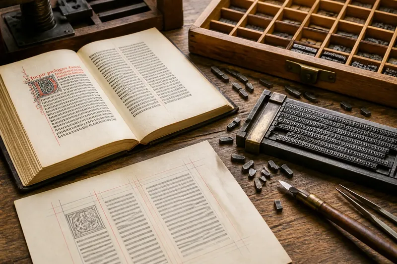
How did printed pages become orderly without beginning with a grid? Page layout history starts with people arranging words and images by hand, using inherited conventions, available tools and the practical need to guide a reader. The grid came later as a way to make those choices repeatable, not as the source of order itself.
What did a page look like before a grid?
Early printed books borrowed much from manuscripts. Scribes had established patterns for margins, lines of text, decorated initials and divisions between passages; printers adapted familiar habits to type and press. A page’s organisation was therefore visible, but it did not necessarily come from a measured network of columns.
In hand composition, a compositor set individual pieces of type into a frame. The words had to fit the available measure, and spacing could be adjusted to make lines sit evenly. Printers could align type and images through craft and repeated practice, even when no drawn grid dictated every position.
Pages also had material limits. Type, paper, presses and the labour involved in setting a forme all shaped what could be produced. A broad margin or a centred heading was not merely decoration: it helped distinguish the text from its surroundings and made the page easier to handle and read.
Why did early books repeat familiar arrangements?
Readers recognised conventions. A title page, running head, paragraph opening or marginal note could signal what kind of information followed. Repetition helped people find their place, while visual differences marked changes in rank or purpose.
These patterns were often built from local decisions rather than a single plan covering the whole page. A heading might be centred, a block of text set to a steady measure, and an illustration placed where the printer could accommodate it. The arrangement could still feel coherent because the choices followed shared expectations.
That distinction matters: a page can have order without a formal grid. Alignment might come from matching left edges, consistent indents, recurring margins or a common centre line. Such cues make relationships legible, even if each element has been positioned separately.
How did printing encourage more regular layouts?
As print production expanded, repeatability became increasingly useful. A book or newspaper needed pages that belonged together, and workshops relied on conventions that could be taught and reproduced. Type sizes, column widths and margin practices offered reliable starting points.
Newspapers made the value of recurring structure especially clear. Several columns could accommodate long text while allowing readers to scan headlines and move between stories. The columns were not simply a tidy surface: they managed the relationship between limited page space, continuing copy and the reader’s route through it.
Mechanical production also encouraged standardised formats. When pages shared dimensions and recurring parts, printers could work more predictably. This did not remove judgement. Editors and compositors still decided where a story began, how much prominence it deserved and where an image would make sense.
When did the grid become a design tool?
The grid became a more explicit tool as designers sought systems for organising complex pages and related publications. Instead of aligning each item by eye alone, they could divide a page into columns, margins and intervals, then place elements in relation to those divisions.
This approach suited work that needed consistency across many pages, such as magazines, catalogues and informational publications. A grid could define where headlines, body text, captions and images belonged while leaving room for variation. It made layout decisions easier to repeat, inspect and revise.
Grids did not simply make pages uniform. A designer could span an image across several columns, leave a deliberate gap or break an alignment to emphasise a particular element. The system provided a shared reference; it did not dictate every choice.
What does alignment tell a reader?
Alignment signals which elements belong together. A shared edge can connect a heading to the text below it; consistent spacing can distinguish one section from another. When unrelated items line up by accident, readers may assume a connection that the content does not intend.
Alignment also creates a reading path. A stable text column supports sustained reading, while a clearly separated caption lets the eye identify supporting information. The designer’s task is not to align everything indiscriminately, but to make relationships visible and keep competing signals under control.
Imagine a community notice sheet with event titles, dates and short descriptions. If each title begins at the same left edge and dates occupy a consistent narrow area, a reader can compare events quickly. If one notice breaks the pattern, give that difference a reason—perhaps it is a featured event—so the departure reads as emphasis rather than a mistake.
How can you recognise the layout logic on a page?
Look for repeated edges, recurring gaps and consistent widths before judging whether a page is attractive. Those clues reveal the system, if there is one, and show how it groups information.
- Check the margins. Notice whether text and images respect a common boundary. If they do, that edge may be a basic alignment rule.
- Compare column widths. See whether repeated text blocks share a measure. A consistent width often supports a steady reading rhythm.
- Follow the headings. Look at their position, size and spacing. Repeated treatment helps readers recognise sections without making every page identical.
- Inspect captions and notes. Check whether secondary information has a distinct, consistent relationship to the material it explains.
- Notice exceptions. Ask whether a shifted element signals importance or simply disrupts an otherwise clear pattern.
For a quick exercise, choose a page in a book or magazine and trace its left edges with a pencil on a separate sheet. Mark where the text measure changes and where images cross those lines. You will often see a small set of decisions doing more organisational work than the page’s decoration.
Which questions help explain page layout history?
Were early printed pages designed without alignment?
No. Printers and compositors aligned type and images through craft, inherited conventions and practical adjustments. What was less common was an explicit grid governing every component.
Is a grid the same as columns?
No. Columns are one part of a grid, which may also include margins, spacing units and horizontal divisions. A page can use columns without a fully articulated grid, or use a grid to align elements that do not form text columns.
Why do some layouts break their grid?
A deliberate break can draw attention, create contrast or accommodate content that needs a different shape. It works best when the surrounding structure remains clear enough for readers to notice that the change is intentional.
Do digital pages still use print grids?
Many digital layouts borrow grid principles, but screens can change size and content may reflow. Designers use flexible columns and spacing rules so the underlying relationships remain understandable as the available space changes.
What is not worth the effort?
It is rarely useful to force every item onto one rigid set of lines just to make a page look systematic. A grid should help explain relationships, not become a puzzle that content must obey at any cost. If readers cannot tell what belongs together, adjust the hierarchy or spacing rather than adding more divisions.
Page layout history is a record of practical choices: how to fit words, distinguish kinds of information and help readers move through a surface. The grid made those choices easier to repeat, but its deeper value is the clarity of relationship it can provide. When you inspect a printed page, look first for the alignments that help its information hold together.