Dropdown or Radio Buttons for a Short List?
Dropdown or radio buttons for a short list? Compare visibility, scanning and the extra opening action to choose a form control readers can use with ease.
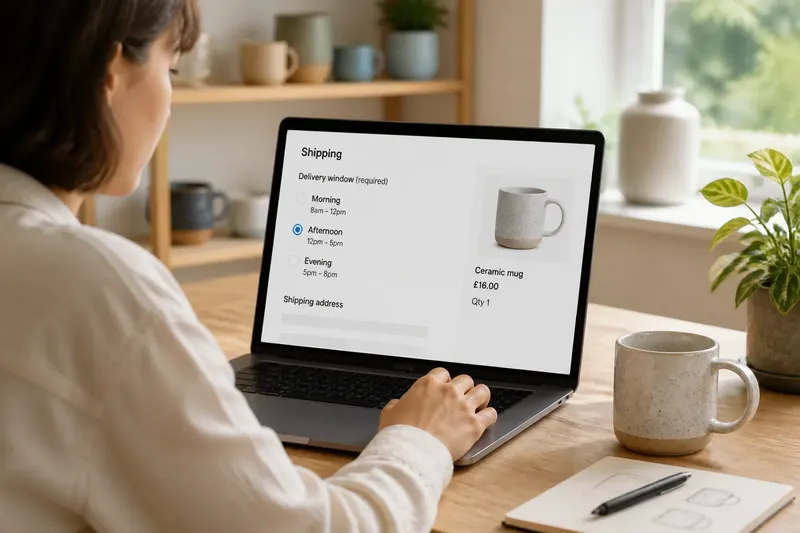
Dropdown or radio buttons for a short list? If a checkout asks someone to choose “Morning”, “Afternoon” or “Evening”, should it show every option or keep them behind a menu? The answer depends on whether seeing the alternatives helps the reader decide and whether the page has room for them.
Begin with the reader’s decision
Imagine a small shop designing a checkout for a ceramic mug. The delivery-window choice is required, and all three options have equal status. A dropdown keeps the form compact, but hides the alternatives until someone opens it. A radio group displays every option immediately.
Both controls allow one selection. The difference is what readers can see before they act and how many actions they need to make a choice. Ask whether someone is likely to compare the options or simply recognise a familiar value and continue.
Dropdown or radio buttons affect what readers can see
Radio buttons put the complete set on the page. Someone scanning the checkout can notice every delivery window without opening a control. This helps when options are short, distinct or worth comparing.
A closed dropdown shows a prompt such as “Choose a delivery window” or the selected value. The other choices appear only after the reader opens it. That can be a reasonable trade when a form has many controls or the options are familiar, but it makes alternatives less visible at first.
Radio groups take up space, and long labels can make a page harder to scan. A dropdown saves room in its closed state, though its compact appearance conceals the available choices. Compare the space occupied by the radio group with the benefit of immediate visibility.
Check the list before choosing a control
Use the actual labels and the surrounding layout to make the decision. For each check below, note what you observe and follow the relevant branch:
- Check whether the reader needs to compare the choices; if comparing matters, show the options as radio buttons, otherwise consider a dropdown.
- Check whether there are only a few options; if all fit comfortably in the form, use radio buttons when visibility helps, otherwise consider a dropdown.
- Check whether labels are short and easy to scan; if they fit clearly beside radio controls, use the visible group, otherwise try a dropdown and inspect its opened state.
- Check whether the page is already crowded; if showing the group would interrupt the form, use a dropdown, otherwise keep the options visible when comparison is useful.
- Check whether the options are familiar values that need little comparison; if they are, a dropdown may suit the task, otherwise show the distinct choices together.
- Check whether the task allows one selection or several; if it allows one, use radio buttons or a single-choice dropdown, otherwise choose a control designed for multiple selections.
- Check whether a proposed default reflects a deliberate choice; if it does, show that selection clearly, otherwise start with a prompt so the form does not imply an unmade decision.
Inspect the control in its real layout
In the mug checkout, the three delivery windows are easy to understand, and a reader may already have a preference. Radio buttons let them scan, select and move on. A dropdown adds an opening action before they can inspect the alternatives. That small extra action may be acceptable if a visible group would crowd the form; it is harder to justify when comparison is useful.
Now imagine the options read “Morning, when someone is home”, “Afternoon, after the school run” and “Evening, before the building desk closes”. These longer labels provide useful context but need room to wrap. A dropdown can keep the initial page shorter, while radio buttons expose each explanation without an opening action. Check the actual wording at the intended screen size rather than deciding from placeholder labels.
Say the shop designer has a checkout with three short, distinct delivery windows and enough room beside the address fields. The designer checks whether readers need to compare them and decides that seeing all three helps. They replace the dropdown with a labelled radio group, then inspect the page to confirm that each label is readable and its selected state is clear. The result is a form where all the choices are visible; if the labels become long or the layout feels crowded, the trade-off shifts towards a dropdown.
Make the control clear and usable
Give the control a clear label. “Delivery window” tells readers what the group is for; “Choose one” alone does not. If a choice is required, say so in the form’s language and explain any consequence that could affect the decision. Do not rely on a placeholder as the only label, because it may disappear after selection.
For radio buttons, make each label easy to associate with its control, provide enough separation and show which option is selected. Where the interface allows it, make the label clickable as well. For a dropdown, distinguish the prompt from a valid answer and keep the current choice visible after selection. Preserve familiar keyboard behaviour and check that assistive technology can identify the labels and selected state.
Which control fits your short list?
Are radio buttons better for three choices?
They can be a good fit when the options are distinct and useful to see together. The number of choices alone does not decide it; label length, available space and the need to compare matter too.
Does a dropdown always save space?
It takes less room while closed, but the choices still need to appear when someone opens it. Check the complete interaction, not only the control’s resting appearance.
Should the first option be selected by default?
Only when it is an intentional, sensible default for the task. If readers need to make a considered choice, begin with a prompt rather than implying that they selected an option.
What if the list grows later?
Review the control when the options change instead of keeping the original pattern by habit. A longer list may suit a dropdown, while added explanations may make visible options more helpful despite the space they need.
Spend effort on the choice, not decoration
It is not worth polishing a chevron or debating tiny spacing differences before confirming that the control suits the task. Write clear labels first, then compare the page with the choices visible and hidden. That exposes the real trade: immediate scanning against a more compact first view.
For a short list, dropdown or radio buttons is a decision about how much of the choice to show before asking someone to act. Choose radio buttons when seeing alternatives helps; choose a dropdown when compactness matters more than instant comparison. Check the completed form at the screen size readers will use, since a good choice depends on the labels and layout they actually encounter.